by Jean-François Messier
In sales, there are four good reasons to use slides. Your sales presentation will be more effective with slides than without them if you use them:
- To explain, i.e., to make clients understand you
- To prove, i.e., to make clients believe you
- To summarize, i.e., to make clients retain your key messages
- To influence, i.e., to make clients change their minds or arrive at a decision.

Otherwise, if there are other goals you are trying to achieve (to respond, discuss, present, reformulate, inform, provide detail, etc.), switch off the video projector and do it without digital support: a sales meeting needs a balance of digital and analog.
In sales presentations, tailor your slides to your goal
Tailor the slide to your goal. Depending on whether you are aiming to explain, prove, summarize or influence, you need to use different tools. Sales reps who want to do away with slides full of text start by putting photos everywhere, and end up inflicting Death by (Pretty) PowerPoint. Visual doesn’t always mean a photo.

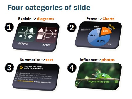
- To explain, we use diagrams and drawings. Their role is to enable the client to visualize in a matter of seconds what the sales rep is trying to explain, so as to facilitate and accelerate understanding.
- To prove, we use charts. I said charts, not tables of figures. Keep the figures and tables for the written presentation, because slides are not the right medium for analysis. Charts have the advantage of allowing the client to grasp the point illustrated by the figures in under three seconds. For very striking data where the number speaks for itself, you can show it in very large type (150 point or more), without a chart.
- To summarize, we use slides with text. Beware of the number of ideas you are asking the client to memorize. The point of your presentation is your number one goal. If the client retains just one idea from each presentation, that’s already an achievement. I doubt a client can realistically retain more than two or three ideas in a sales meeting. Here, on the illustration, I show five, and frankly that’s a lot. In this case, show them one line at a time while gradually dimming the ones already covered, so that the client is able to keep sight of the overall picture.
- To influence is when we use photos, to access the emotional side of the brain, where decisions initiate.
Tailoring your slides to your goal helps avoid presentations full of pictures, which Phil Waknell dubbed “Death by (Pretty) PowerPoint.” The balance of the goals is what makes for visual balance in a good sales presentation.
see also Presentatievaardigheden – Story telling


